

INSZOOM – UX Strategy & Research for FN Portal Revamp
Leading research synthesis and UX strategy for enterprise immigration workflows focused on reducing confusion, improving case visibility, and uncovering operational friction patterns.
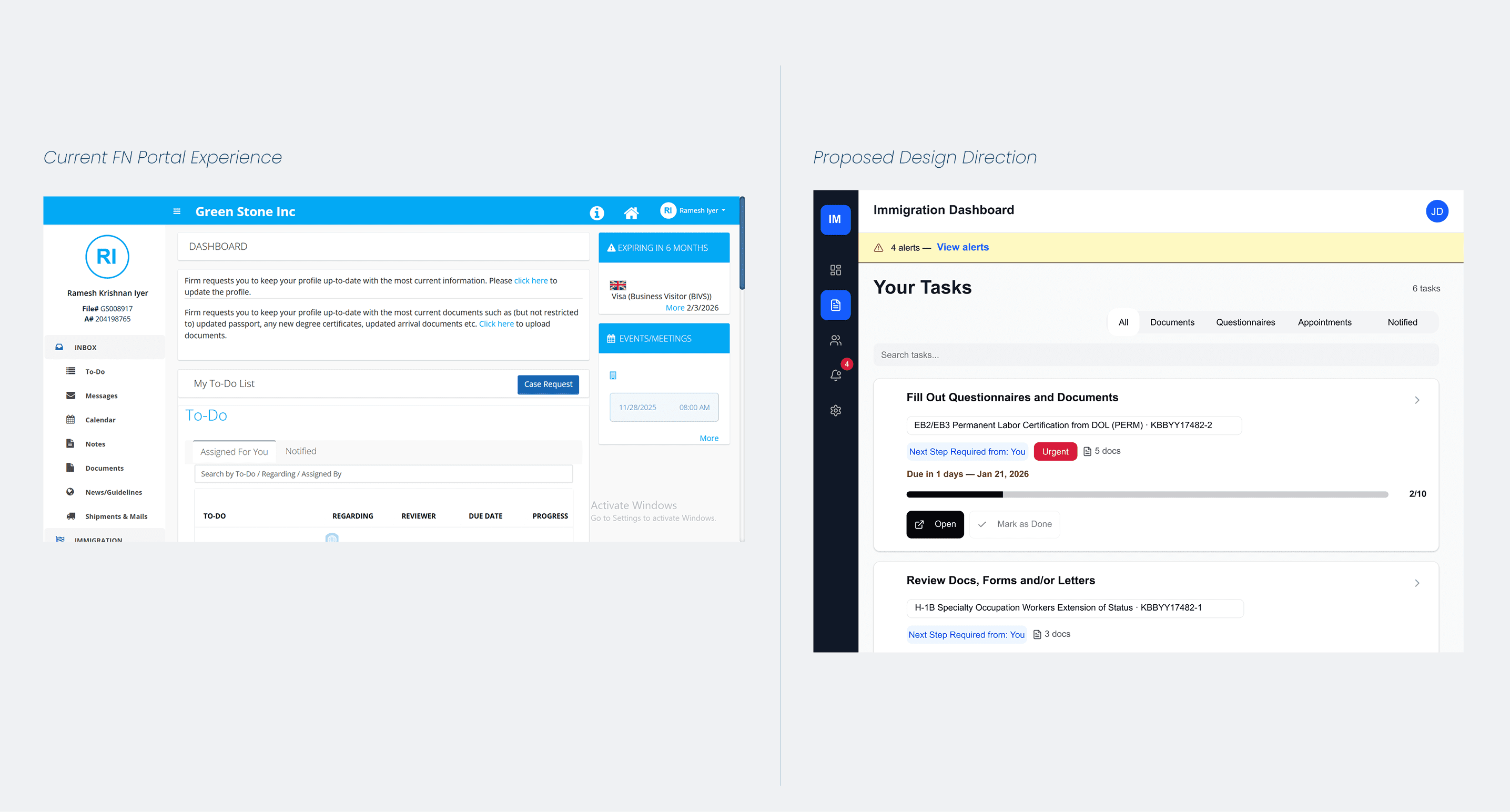
INSZOOM FN Portal Revamp
Senior Product Designer (UX Strategy & Research)
Mitratech
Research synthesis, workflow analysis, UX strategy
Foreign Nationals + Case Managers
Quick Story
I joined the project mid-way after the previous designer transitioned out of the team.
The portal already had extensive functionality. But users consistently described the experience as overwhelming and difficult to navigate. Existing survey feedback surfaced frustration — but lacked the specificity needed to guide design decisions.
I pushed for deeper research with Case Managers — the people absorbing user confusion every day.
What emerged wasn't a feature problem.
It was a communication problem.
The system already contained the right information. Users simply couldn't understand:
where they were
what was happening
what they needed to do next
That insight became the foundation of the redesign direction.
Context
INSZOOM is an enterprise immigration platform used by global organisations to manage immigration workflows and compliance processes for international employees.
The primary users included:
Foreign Nationals navigating high-stress immigration workflows. Case Managers handling large volumes of employee support requests.
The experience carried unusually high emotional stakes. Confusion inside the platform directly impacted users' sense of security, visibility, and confidence during immigration processes.
The Problem
The existing portal had accumulated significant usability debt over time.
Users struggled to understand case status, identify next steps, interpret notifications, and confirm document uploads.
As a result, Case Managers absorbed high volumes of avoidable support requests daily.
The product already contained most of the necessary information — but the experience failed to surface it clearly.
5/5
Users completed core tasks independently
3
Behavioural patterns identified through research


Process
Research & Discovery: Initial survey feedback repeatedly described the experience as overwhelming, confusing and unintuitive.
But those signals lacked behavioural specificity.
To uncover deeper patterns, I collaborated with PMs to conduct focused interviews with Case Managers across enterprise accounts.
Three recurring behavioural themes emerged consistently:
uncertainty around case status
confusion around notifications
lack of clarity around required next actions
The research reframed the problem entirely.
Users weren't failing because the workflows were impossible.
They were failing because the system wasn't communicating effectively.
Key Insight: "The portal already contained the right information. The real problem was making that information understandable at the moment users needed it."
Design Thinking:
Clarity over information density
Surface actions before details
Reduce operational ambiguity
Make workflow progress visible
Support high-anxiety user states through guidance and confirmation
Design Decisions:
Decision 1 — Task-focused dashboard: Reframed the dashboard around immediate next actions instead of dense information listings.
Decision 2 — Persistent status visibility: Introduced clear status communication using simplified progress states: Waiting on You, In Progress, Under Review, Completed.
Decision 3 — Workflow restructuring: Reorganised complex multi-step workflows into guided progressive flows with visible completion tracking.
Decision 4 — Document visibility redesign: Improved upload confirmation and document visibility to reduce duplicate submissions and support dependency.







"The data users need is often already present inside enterprise systems. The challenge is designing experiences that communicate it clearly when it matters most."
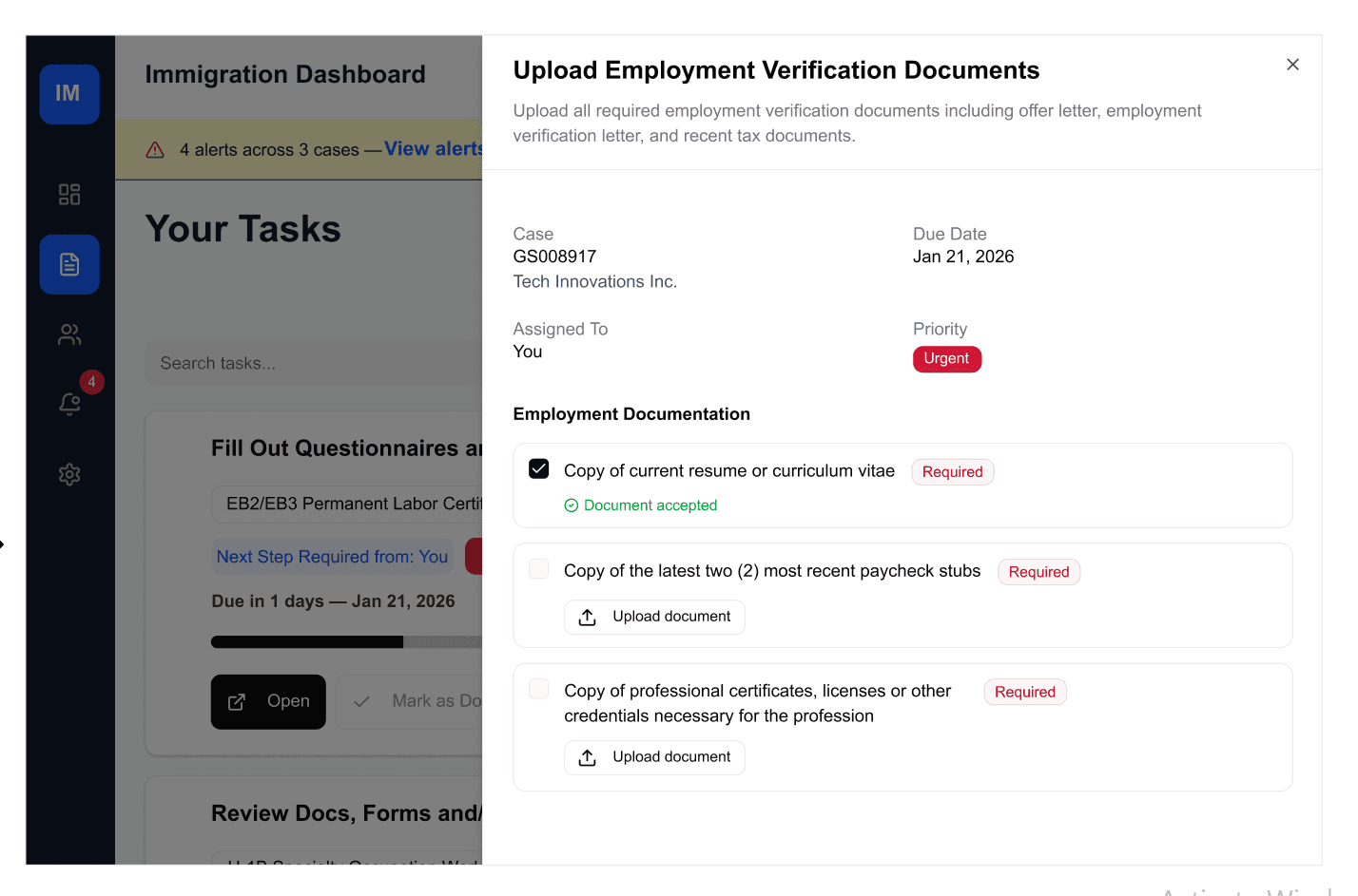

Solution Summary
Research-led UX strategy direction
Task-focused dashboard redesign
Simplified workflow structures
Persistent status communication
Improved document visibility patterns
Reduced operational ambiguity across workflows
What I'd Do Next:
Measure long-term workflow confidence post-launch
Track support ticket reduction patterns
Expand workflow instrumentation through behavioural analytics
View All Work